
OMID NHL Preview Part 2 - Pacific Division
I think I'm the only one here who likes sports, or at least the only one that likes watching professional sports. Oh, you don't watch hockey you say? You want to get into it this year, I hear? Well use this kinda useful mostly useless guide to deciding what team you should follow, primarily based on how much we like what they're wearing.
Each NHL team is graded by our panel of sports experts, Joe Menjivar, Lucas Roberts, and Adam Kostiuk. I can't say for sure, but at least one of us has watched a full hockey game in the past 12 months. Teams are to be judged on the following criteria: logo design, team colours, uniform design, and mascot/intangibles if they don't currently have a mascot. We've also included a handy section where we'll put a short blurb about who each teams best player is. There are no points for being a good player.
Anaheim Ducks
Best player:

A toss up between their captain, championship caliber bald man Ryan Getzlaf, and all round mega hockey stud Corey Perry. I’m leaning Getzlaf only because he played for my hometown Calgary Hitmen when I was a kid, and I guess because Corey is a silly name.
Logo: 2/10
This is a bad logo. The city of Anaheim should demand reparations for this abomination. I guess it’s like a weird gold D, but its also like a webbed foot or something. It’s bad. Their original logo (used from 1993-2006) of an old style goalie mask shaped into a duck face, was still really stupid but much better. It at least said ‘duck’, you know? This gold D just says ‘the team owners' son just learned Photoshop’.
Colours: 8/10
The colour palette is kinda nice, using a combination of black, gold, white, and orange that is really unique. I was skeptical of the duck bill orange but it really gives it an aquatic bird vibe that wasn’t there for me in previous incarnations of their uniforms, and the gold is a nice (in theory) reminder of their championship pedigree, having won the Stanley Cup in 2007.

Uniforms: 6/10
Look, I wouldn’t wear this jersey on a date. Ok, I wouldn’t wear any jersey on a date because I’m neither Happy Gilmore, or a guy with a soul patch. The gold, which I thought was nice in theory is one colour too many on the uniform. The orange is instrumental here for breaking the uniform up tonally, the gold and black would be quite drab without it, the white doesn’t add much for me.
Mascot/Intangilbles: 7/10
Their mascot might be the only thing left of the Disney/Paul Kariya/Teemu Selane era. I for one am glad they’ve kept Wild Wing on board. He is seemingly modeled after the original Ducks logo (back when they were still mighty) and he shares a name with the leader of the Mighty Ducks in the Disney produced cartoon, the hilariously named Wildwing Flashblade who was played by the legend Ian Zeiring. Anything involving Ian Ziering is a positive in my books.
OVERALL: 26/40
Arizona Coyotes
Best player:

Pfffffft, who even knows? Maybe Oliver Ekman-Larsson? Maybe the new kid, Dylan Strome? Arizona is not a great team, you guys.
Logo: 7/10
I like it. Maybe I just like dogs, but I think the Coyotes logo is kinda adorable. It’s a major step up from the old peyote induced fever dream they sported from 1996-2003. It’s rather modern without being too abstract, you know?
Colours: 3/10
This year they’re bringing black into their barebones Oxblood and white colourway. The black doesn’t do anything for me if I’m being honest. I think they would have been better served going with a tan perhaps, to bring out the tan underbelly of the coyote in their logo. They were better off leaving things the way they were last season, they should have at least consulted me.
Uniform: 5/10
I just said how much I don’t like the addition of black on these uniforms, I’m also critical of the change they’ve made to the sleeves. I liked last seasons three hoops a lot more than I like whatever we’re calling this. I just generally don’t care for any of the changes they’ve made. I suppose the introduction of black pants breaks up the monotony of all red home uniforms, so at least now they don’t look like onsies. Cool dog logo though.
Mascot/Intangibles: 4/10

Their mascot looks like 80% of Deviantart. His name is Howler (kinda cool), but it should be Yiff (not cool).
Overall: 19/40
Calgary Flames
Best player:

Captain Mark Gioradano. He could have been a contender for the Norris Trophy if not for a shoulder injury that prematurely ended his season. You can also make arguments for future captain Sean Monahan, and sophmore Johnny Gaudreau, who was tied for the lead in rookie scoring last season. Neither is as polished as Giordano though, but ask me again in a year or two and the answer will more than likely be one of those two.
Logo: 7/10
It’s ok, I guess. A stylized C with flames coming out the curved side. It has it’s charms, and it’ll probably never get changed because nobody hates changing the status quo more than hockey fans. The ‘A’ on the chest of the alternate captains is a nice nod to the history of the franchise. There’s no reason they couldn’t do that with the captain’s ‘C’ if they ever updated their logo in the future. It’s very drawable on a kids duo-tang, which is a plus.
Colours: 8/10
Red, white, yellow and black. Pretty on the nose for a team called the ‘flames’, but you can’t exactly have these dudes rolling in wearing green and blue.
Uniforms: 6/10

They are in desperate need of a refresh, the last update for the main uniforms was done in 2007. The Flames’ third jerseys are garbage though. I hate them. I wish they would go back to using their classic 80’s look as their 3rd jersey. Actually, I wish they would just not use an alternate jersey and just update the main look. The details are nice, like the use of the old Atlanta Flames logo as the ‘A’ on the alternate captain jerseys, it’s clever. The use of the Canadian and Provincial flags on the shoulders is nice.
Mascot/Intangibles: 10/10
Harvey the Hound is real goofy looking, with his porkpie hat and long floppy tongue. Harvey is also the NHL mascot OG, introduced in 1983 he’s the first mascot in the NHL and they should have just stopped there. Maybe I’m biased because I live in Calgary, I dunno, Harvey rules.
Overall: 31/40
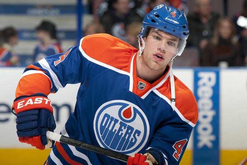
Edmonton Oilers
Best player:
Wayne Gretzky, but he retired a long time ago. I’m pretty sure nobody is even on this team, judging by the last few seasons.
Logo: 7/10
It’s a stupid name, but the logo itself is kinda cool. The colours are nice, and the treatment of the text is unique, and I guess kinda oily.
Colours: 5/10
Blue, orange and white. Not exactly a colour palette that makes you think of oil, if they were going for accuracy I guess they would wear black, the colour of a seagull covered in oil after an oil spill., and I dunno, the colour of blood. I do sorta like the colours they have though, for whatever that’s worth (it’s worth 5 points)
Uniforms: 5/10
I like a bit of orange, these are a LOT of orange, and now I’m legally blind. What is even going on with the new 3rd jerseys? Are they meant to be an homage to oil workers’ high visibility clothing? Because if so, mission accomplished. They are so high visibility you can see them in Peru. They are so loud they aren’t legally allowed to wear them after 10pm. They are so orange, they make Snooki look as pale as my ex girlfriend. Any of them, because they're all pretty pale. I love white women.

Mascot/Intangibles 3/10
The closest thing to a mascot that the Oilers have is Todd McFarlane.
Oh, here’s a thing. Edmonton is the first team in the NHL to have cheerleaders. I’m not sure if it’s a good or bad thing, but it’s a thing. I hope they’re at least compensated adequately. I’m not going to say anymore about it, I don’t want to get fired.
Overall: 20/40
Los Angeles
Best Player
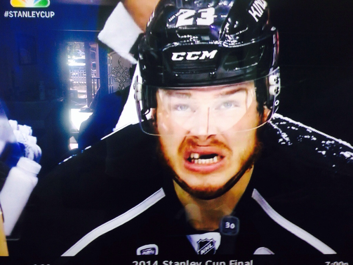
Dustin Brown, clearly not winning for having the most teeth, but for having the sense to save his 3.5 million dollar salary and not get them fixed. It hasn’t stopped him from smiling though and I do respect that!
Logo (Before looking it up)
Lakers? because they played hockey on a lake? I’m willing to guess that’s associated another sport.. It is. As I typed this I came to the realization it’s the name of their basketball team, but I do stand by my logic. What do lakes have to do with Basketball? Less than they have to do with Hockey!
Logo (After looking it up) 9/10
Oh yeah LA kings. I’ve heard of this one. Umm I like it. It’s simple and has become simpler over time and it’s my favorite shade, black.
Colours 0/10 Shades 10/10
Best colour, it’s all the colours. Black. Extra points for being the most goth team
(editors note: I'm not sure if this is accurate.)
Uniforms 9/10
I’m incredibly happy they ditched gold purple for the black white. This is clearly the tuxedo of hockey jerseys. If I ever thought that I would buy a hockey jersey to wear around and LA somehow became part of Canada then this would be the one I’d buy. Probably not going to happen though, so I’ll save my pennies for a quebec nordiques jersey, because that has the added bonus of no one asking me about how the team is doing.
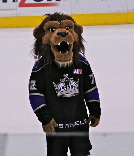
Mascot/Intangibles: 3/10
I’m worried it’s going to be a king. People shaped mascots are only ever creepy… Ok here I go. Never mind I’ll take a creepy looking king over this deformed looking lion.
Overall: 31/40 Maybe if they improved their mascot and became a canadian city they could move up the ranks.
San Jose
Best Player

Brent Burns, he looks like a homeless man. I love it. Joe is always giving me a hard time about my long hair and beard but at least I keep it under control. Brents got a real wild man look going, like Robin Williams coming out of Jumanji for the first time look. Like the yeti that should be the mascot of the Avalanche. Good job Mr Burns. Good job
Logo (before looking it up)
SHARKS! with the shark biting the hockey stick! I couldn’t tell you how I knew this one. Probably because sharks are kinda cool, and have nothing to do with hockey.
Logo (after looking it up) 8/10
I like it, I definitely remember the old one but the new one looks kinda cool. Definitely updated, shark looks more dynamic, like it was pulled from the pages of a comic book about a shark who also happens to play hockey. They even made the little triangle in the back a little more exciting. I don’t approve of the shark as a point mind you. That’s a animal with no business around ice.
Colours 2/10
I’m not a fan. Seafoam green is a colour that should be reserved for kitchen appliances and poodle skirts. As a franchise colour I appreciate that it is something different but it really lends itself more to cartoons than sports teams.
Uniforms 4/10
They responded well to having a slightly more complex logo, and have a less busy uniform. I really can’t get past the colour though. They feel like they would be better suited to the monstars from space Jam. On humans they look just a little too cartoony.

All about jazz, man.
Mascot 6.9/10
Do I need to look this one up It’s a shark right. Yep, well I mean it’s not a good looking shark, but there really is a diminishing return when you try anthropomorphising animals. Especially the slimy fish like ones. He looks furry and huggable, but then he doesn’t really look like a shark, more like a messy childrens drawing of a bear.
Overall: 20.9/40
Vancouver Canucks
Best player

This dude. He flipped like 20 cars, and set fire to another 8. A blue chipper if I ever saw one.
Logo: -10/10
This thing suuuuuuuucks. The Canucks have a long history of bad logo’s. I just hate the Canucks so much.
Colours: 1/10
I like blue, I guess.
Uniform: 0/10
I feel like I’m alienating any potential readers. I dunno, I don’t think any of my Vancouver friends even care about hockey, and if they do, they are probably Flames fans because they’re from Calgary.
Mascot/Intangibles: 1/10
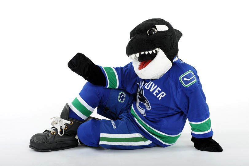
Dumb Orca. But at least they have a mascot.
Overall: -8/40
Joe Menjivar just wants senpai to notice him
Lucas Roberts needs a shave and a haircut
Adam Kostiuk once killed a man in prison