
OMID NHL Preview Part 1 - Central Division
I think I'm the only one here who likes sports, or at least the only one that likes watching professional sports. Oh, you don't watch hockey you say? You want to get into it this year, I hear? Well use this kinda useful mostly useless guide to deciding what team you should follow, primarily based on how much we like what they're wearing.
Each NHL team is graded by our panel of sports experts, Joe Menjivar, Lucas Roberts, and Adam Kostiuk. I can't say for sure, but at least one of us has watched a full hockey game in the past 12 months. Teams are to be judged on the following criteria: logo design, team colours, uniform design, and mascot/intangibles (if they don't currently have a mascot). We've also included a handy section where we'll put a short blurb about who each teams best player is. There are no points for being a good player.
Chicago
Best Player:
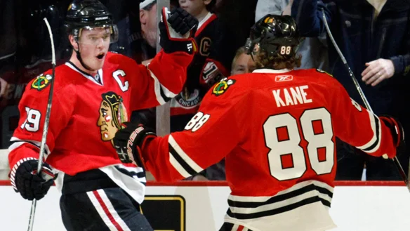
THE KANE AND TOEWS POWER HOUR WILL CONTINUE RIGHT AFTER THIS ASS KICKING. ALL HAIL KING KANE AND TOEWS THE BLAZE. Extra kudos to Toews for rising above his bleak Manitoba upbringing to successfully plant himself amongst a bunch of winners.
Logo: 5/10
I mean, if your team is going to be named after an ethnicity, the least you can do for them is portray them in a relatively respectable way. This Native American doesn’t look particularly happy or sad, he’s just kinda chillin' in a pseudo-authentic Native American art style. I mean, it’s the kind of team that if they kicked your ass, it’d be kind of hard to be mad about. Maybe that’s the secret to their success? Just classy enough to not be foul, just relaxed enough to not inspire, but still noble. I mean, if you’re gonna call your team the Blue Jackets or the Islanders you’re just asking to get your ass kicked is all I’m saying.
Colours: 7/10
Awwww yeah…. That red, black, and white is a colour combo for all time. It’s absolutely timeless, not stuck in any particular era, unlike the other original six teams and their 1920’s blue or ‘the carpet at grandma’s farmhouse’ yellow. It’s striking, crisp, and looks good in many different variants. And also it taps into that primal part of the male (or female) brain that says “OOOOH LOOK AT THE SWEET RACECAR COLOURS VROOM VROOM KANE AND TOEWS SHINY SILVER CUP AW SWEET I WANT THOSE COLOURS ON MY BODY.”
Uniforms: 8/10
Many jerseys in the NHL have some variation of stripes on their Jersey, but none have so committed to their pattern like the Blackhawks, and for good reason. Most stripes can’t claim the title of ‘iconic’ (except for maybe Jack’s white ones) but when those double or triple tier stripes roll out, you know there’s some history rolling onto the ice, history that says “VROOM VROOM TIME FOR SOME SPORTS AND BLOODSHED”
No complaints about the font, the sizing, or any of the patches either. Those perfectly horizontal stripes have served them well. Good on the Blackhawks for knowing a winning formula when they see one
Mascots/Intangibles: A conflicted 2/10
Turns out all you need to not be called out for cultural appropriation is to actually be a winning team. Huh. Sorry Cleveland.
Well, at least their mascot isn’t just literally a guy in a giant foam Native American head. Come to think of it, I think I saw something like that at Coachella this year.
Although reducing the tools of a civilizations rich history to the pun-inspired name of a giant cartoon hawk isn’t exactly admirable, the hawk itself is a decent design and the suit looks maneuverable, so the ergonomics of the thing get some credit. Lucky for the guy who has to wear the thing. Not so lucky for the victims of years of perpetuated cultural insensitivity.
REDEMPTION ROUND:
+10 Points for Stan Mikitas Donuts! Not only one of the league’s most legendary centers, Stan Mikita was also featured as the proprietor of the fiction Stan Mikitas Donuts in the all-time classic movie Waynes World, serving as a parody of popular Canadian coffee and low-quality edibles chain Tim Hortons. The Blackhawks proxy presence in the movie Waynes World serves to alleviate the massive gap in how much Canadian/hockey humour and culture is depicted in Hollywood, and how much it should be.
Overall: 42/40
Colorado.
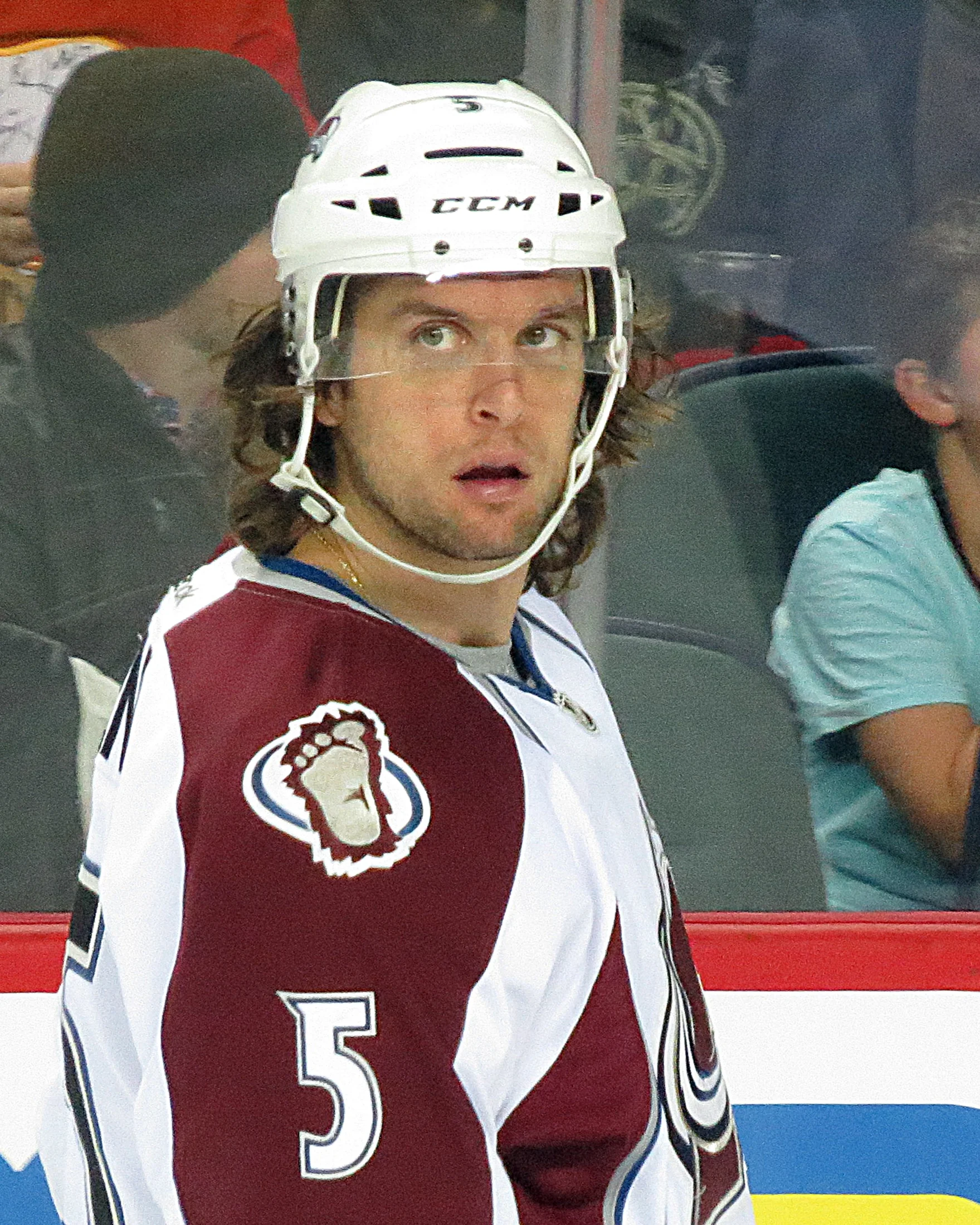
Best Player
Nate Guenin, for looking the most like someone who was brought of the street shoved into a pair of skates and handed a stick. Also maybe he’s a nice guy.
Logo (Before looking it up)
Avalanche? Didn't they play the flames during that brief time where I thought that I might want to try caring about hockey to not feel like such an outcast in junior high?
Logo (After looking it up) 0/10
Thank goodness I actually knew a team. I don’t know if they ever played Calgary in a playoff run, or if I just imagined that. My biggest draw to the hockey was that I might get to see a boob during a the red Mile thing.
Logo is awful though it looks like a waterslide. Maybe it could be the crest for a cliche superhero? The old logo (the one for the Quebec Nordiques) is perhaps my favorite so far, looks like an elephant with a ball. (10/10)
Colours 0/10
Dreadful.
Uniforms -9/10
Why would any person put a foot on their Jersey? The rest of us have the good sense to hide them in socks and shoes! I hope someone has been fired for this and the only reason they remain is lack of funds to replace the jerseys. I’d fund a kickstarter for that.
Mascot/Intangibles:-10/10
OK, so at one point it was howler the yeti but he has been replaced with Bernie the dog? The yeti thing kinda explains the foot but why in the world would you keep the foot and switch to a dog? Admittedly the yeti looks like and old man in sweatpants but the dog has absolutely no character at all. Like they picked him up from any local costume shop.
Overall: -19/40
What’s going on here? I honestly think they went out of there way to make a team I would not like. I suppose they I’m not the one watching hockey though, maybe everyone in Colorado is just really into feet? Whatever it is they’ll have me actively cheering against them.
Dallas
Best Player:
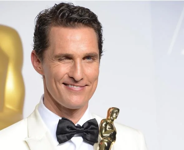
Matthew McConaughey. Easily one of the better screen players around right now, and… hold on, someones saying something about the definition of player. So like… “All the worlds a stage, we are players, yada yada” doesn’t count? …. Shit. Well, I don’t know enough about hockey so I’ve made my choice and I’m stickin' to it… alright alright alright.
Logo: 2/10
Yep, that’s a D for Dallas and a star for Stars. Throw a slant in there and some beveling and boom, it’s still TWO THOUSAND AND FIVE. COME ON NHL, STEP UP YOUR GAME.
Colours: 3/10
Green and white. It’s too bad they didn’t maintain the original colour scheme of the Minnesota North Stars because they could really use that extra yellow. At least the green is kind of nice?
Uniforms:3/10
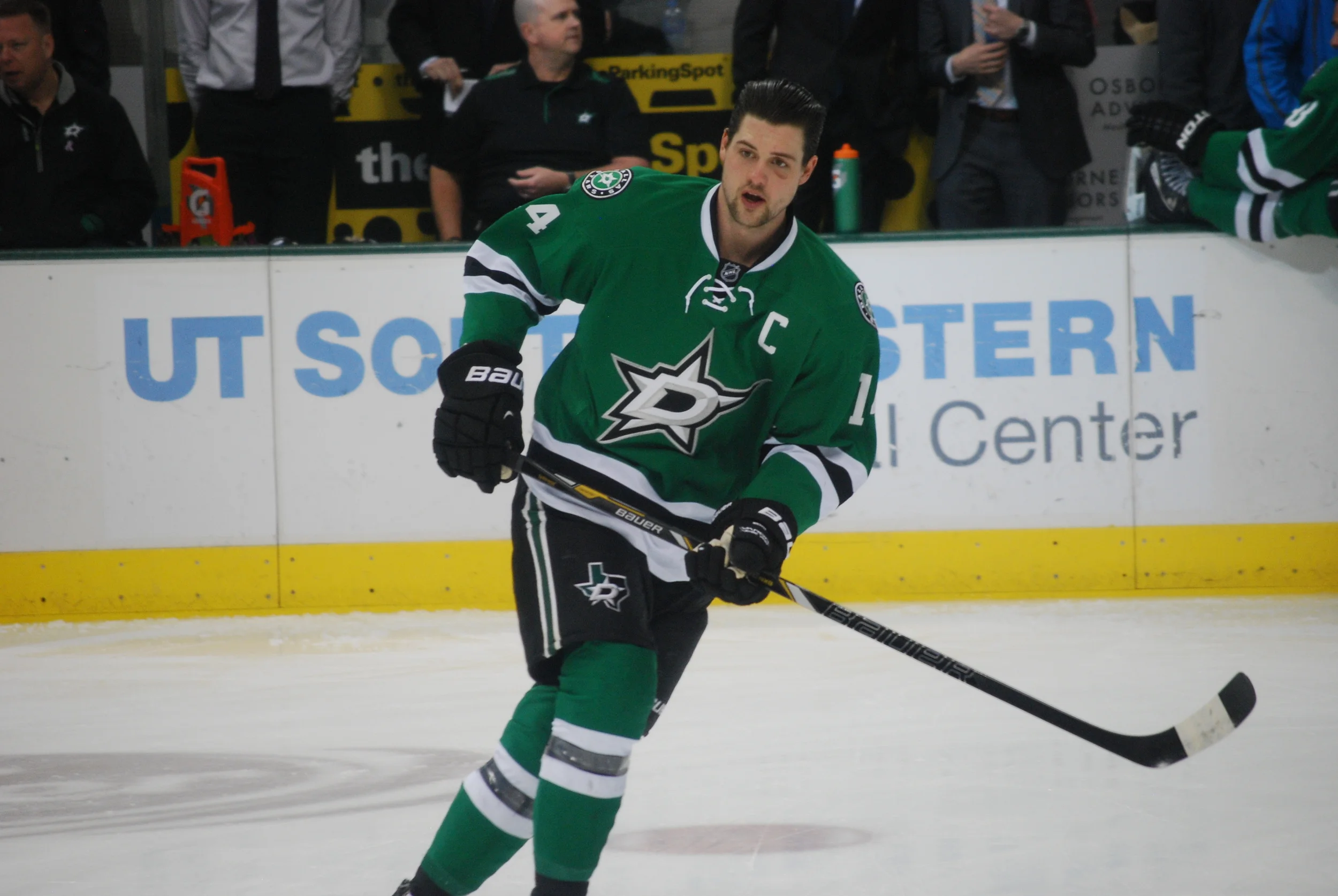
It’s too bad copying the Blackhawks stripe scheme couldn’t do anything for them. Buncha hacks. Get your own damn stripes.
Mascots/Intangibles: 6/10
Any team that has the balls the have their nickname be “The Big D” gets at least some credit.
Overall: 14/40
Minnesota

Best Player
Mike Reilly. He looks like a 16 year old shit head who still thinks poo jokes are the funniest things in the world. He also has an older brother who showed him the budweiser Whaaaasssupp ads and he’s basically taken that in as his personal manifesto. He’s really uncomfortable with homosexuality but he has a best friend who came out so he always makes sure that people understand that he has a gay friend after he calls them [nope, cant say that]. Maybe this doesn’t make him the best player but also maybe none of this is true. I really hope you’re not looking to this to make any decisions about your fantasy hockey league.
Logo (Before looking it up)
Cheese? This is just making me more aware of how little I know about the bulk of America. I’m thinking they have Muskrats? Miners? Did they film fargo in Minnesota? Do they talk kinda funny and have charming female leads? I would probably name the hockey team after that character.
Logo (After looking it up) 7/10
Minnesota wild. Well the logo is not dissimilar to the Nashville Predators the other team I just learned existed this week. The same focus on a disembodied animal head. That said I like this one much more. It seems at least clever, the mouth is also a steam, the star is also an eye, and the moon is an ear? It also appreciates that just regular outside is kinda scary, it’s dark, cold, and doesn’t have any Wifi. I’m pro this logo but I do admit it looks more like a tourism ad then it does a hockey logo.
Colours 6/10
They look like Canadian tire made a hockey team, but I bet if Canadian tire actually did make a team, they would beat these guys.
Uniforms 8/10
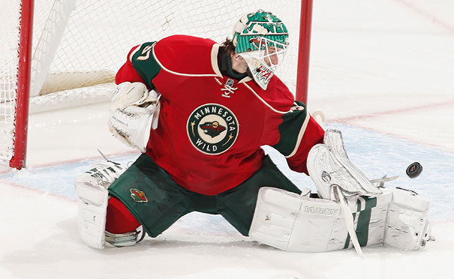
I’m kinda into how vastly different their home, away and alternate jerseys are. I mean clearly this is a team that understands that you have to have different styles for different moods.
Mascot/Intangibles: 9/10
Nordy. He’s a bear, but I think they took personifying the logo a little too literally. He doesn’t need the green trees on his face and the red over his eyes. Though in reading his bio (that’s right I did research) I found this “Nordy lives for hockey and is one of the last players to still sport his "hockey hair" mullet” Well if that’s not worth some bonus points Nothings is.
Total: 30/40
I feel like I want to like this team more than I ever reasonably could. I’m not going to start watching hockey and If I did I wouldn’t be to cheer for an American team. They’re like an ex girlfriend that you dated and she was great just a little more k pop then you ever see yourself putting up with. You want the very best for them but there is no way that that is going to be with you.
Nashville
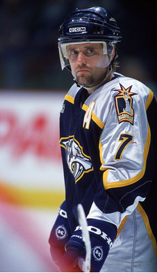
Best Player:
This guy. Whoever he is. He was clearly out for a walk and someone shouted “HEY PREDATOR” at him and the hockey thing didn’t click right away. Then he stepped out onto the ice, and the fans began to chant “Go Preds” over and over. Then here he realized he could not unmake this realization and would forever be know as a predator. That’s no game face, that’s an uncomfortable sad.
Logo (before looking it up)
Nashville.. Nuggets? Country Stars? Probably a horse or some crap like that. What the hell is Tennesee doing with a hockey team? They have football, (they do have football right?) leave hockey to the places with naturally occurring Ice.
Logo (after looking up) 5/10
Well, kinda didn’t get that one at all. Predators eh? It’s clearly a sabertooth… I’m not crazy about “Let’s go preds”? The logo looks like a decapitated and mounted head of an extinct animal, the name reminds me of sexual assault, and they are in a city with more sand than snow.
Colours: 7/10
I don’t hate them, It reminds me of Foster's beer but I can’t imagine that being an issue for anyone else.
Uniforms: 3/10
I don’t see anything special about them. I mean they don’t say preditor on them so that’s a plus, but this still isn’t a wear to the playground kinda jersey.
Mascot/Intangibles: 2/10
This team has.. I just don’t even... Gnash? This is one of the many colourful terms I’ve heard used to describe a Vagina. I’m not saying it’s a good word to describe anything other than a deep wound but it’s certainly not the name I would assign to any beloved childhood entertainer. His face also looks like Rocky Balboas after 12 rounds with apollo creed. Sorry Nashville, I can’t imagine Hockey is your sport.
Total: 17/40
(I only awarded them points for the Mascot because it wasn’t just a man in a stained wife beater and dark sunglasses)
St Louis
Best Player:
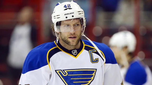
I’m running out of ways to dodge this category. Help. I’m sorry. I’m inadequate and I like hockey I swear but I’m just not that familiar with players oh dear god I’m sorry
Logo: 6/10
I bet it was hot shit in the 60’s and it’s still kind of timeless but let’s face it, a lot of professionals in the public eye born in the 60’s have gotten facelifts and it’s probably about time St. Louis did too.
Colours: 6/10
Blue, more blue, yellow, and white. Its kind of stuck in the 70s, but not in the worst way. The colours make the jerseys seem like a comfortable wood panelled basement with shag carpet. You can picture your dad or uncle hanging out in one of these jerseys, drinking a couple warm beers and making memories with friends, but then you do that for too long and get weirded out by the thought of your parents looking young at some point, so you quit thinking about it and get back to watching hockey.
Uniforms: 6.5/10
I can never seem to pinpoint whats going on around the logo from year to year. Are they sticking with stripes now? Or is this a patches and shapes thing? Wait, are we back to stripes again? Ultimately though the uniforms have generally been good, and the current iteration is no exception, with a good use of colour accenting in the stripes and along the shoulder. Maybe not head turning, but good all the same.
Mascots/Intangibles: 0/10
It’s just a polar bear named Louie. No points are awarded.
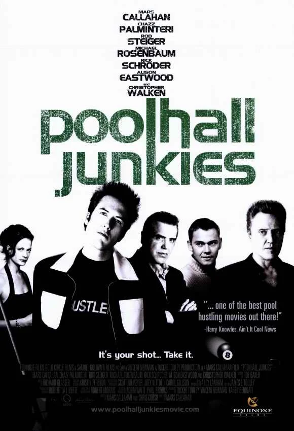
(Editors note: Mike Massey played a character named St. Louis Louie in the 2002 film Poolhall Junkies)
Overall: 18.5/20
Winnipeg
Best Player:
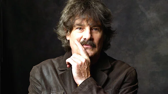
Burton Cummings. Easily one of the most talented musicians out of Winnipeg. It’s easy to imagine why they might name one of their premier performing venues after the man.
Logo: -1/10
Now, normally I’d be bit more lenient, but given that Canadian jersey design is held to a relatively high standard, and that the OLD Winnipeg jets logo was 70’s sports design at its most iconic, the new logo stands as not only a travesty, but an injustice. Why is the jet so ugly and monotone? Whats with the dullest navy ever conceived? Why does the Maple Leaf look like its hiding an awkward gym class boner behind Canada’s regretful military spending decisions?
Colours: 2/10
Blue on different blue on white? Now that’s just sad. Doesn’t Winnipeg have enough to be sad about without being reminded of the bleak colour palette of its long, endless, sunless winters where the polar bears roam the streets looking for blood?
For shame, jersey designer. For shame.
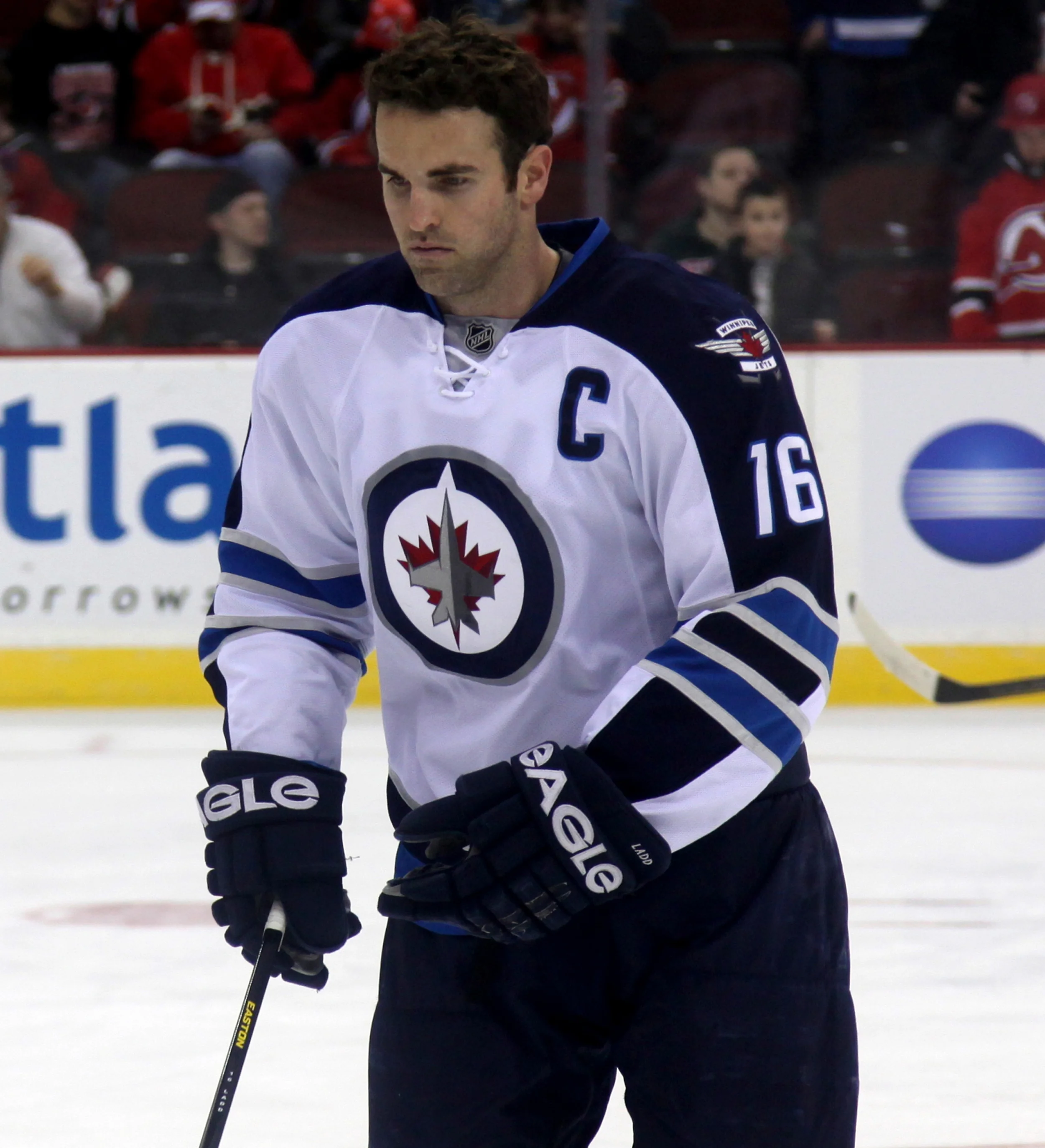
Uniforms: 2/10
Not that they had much to work with given the colour palette, but the layout certainly doesn’t do anyone any favours either. The typeface is as uninspiring as the drive between Melfort and The Pas. This jersey is as much a failure as the Red River Rebellion.
Mascots/Intangibles: Copyright infringement/10
Mick. E Moose? For fucks sake, Canada, not everything we come up with has to be a hackneyed alteration of prominent American culture.
Overall: 3 and a bite from a hawk sized mosquito/40
TOMORROW: The Pacific Division
Lucas Roberts is an executive something or other for Old Media is dead.
Adam Kostiuk is a boy we found on the mean streets of Manitoba
Joe Menjivar is single, ladies.