
This Premier League season has been a disaster
This season so far has been a real train wreck for the top teams in the league, I don’t mean in terms of results, though I am a little upset with the last two Tottenham league games.
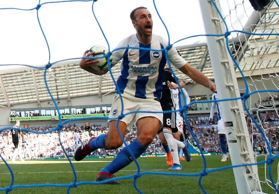
Glen Murray is a very generic name.
What I’m talking about is something far more insidious.
I’m talking about the uniforms. Or “kits” if you’re European, or maybe just want to be (me).
None of the top six squads have what I would consider to be “good” kits. They are either basic and boring, or when they do decide to make a bold design choice it is the wrong choice.
Some of this lack of creativity could be seen over this past summer’s World Cup where eventual winners France wore the same basic Nike top that they are now giving pretty much every team on their roster.
Though there were a few standouts during this summer’s tournament: Germany and their retro-inspired kits, Nigeria’s very popular home kits, and Japan’s home blues were all lovingly designed with their countries history in mind.
But the big kit manufacturers, particularly Nike and Adidas, were too happy to rest on their laurels for a lot of designs, seemingly choosing to work from a template, which isn’t a new trend for them I’m sad to say.
If you can’t even design something special for France, one of the biggest teams in world football with popular world famous stars like Antoine Griezman, Paul Pogba and Kylian M’Bappe, then there is something wrong with you.
The sleeve detail that they have designed and seemingly used with every team isn’t special when all your clubs are using it, this isn’t the iconic Adidas three stripes, it’s a design feature that will likely be gone next year.
When you are working with these large European teams with a century or more of tradition there are often restrictions, that’s understandable. Whether it’s a colour or combination of colours, sashes, stripes or hoops. But it is up to Nike, Adidas, or whoever is designing and manufacturing the kit to work creatively within those boundaries, not just recreate the same shirt year after year.
As much as it pains me to say this, Liverpool might have the most passible home kit this year from the top teams. They’re kind of basic, and the Western Union sponsor logo on the sleeves make them look strangely bootleg, but at least they’re better than the old Warrior joints they used to have, back before they switched to New Balance branding.
Limiting the colour palate to just red and white was a good move. The gold accents on previous seasons shirts were quite garish and for a team that hadn’t placed top four for years it seemed like a joke.
Photos swiped from https://www.premierleague.com unless otherwise noted

The white details are a nice touch, keeping things from being TOO red. Ha ha jk, they’re really really red.

RIP hideous Warrior kits. Photo via a hilarious change.org petition.
Unfortunately for Liverpool things just get worse from there, the away purples are shockingly boring for something that’s purple and orange, and the third kits, a grey on grey number reminiscent of the Warrior days are an eyesore. I think it would be an understatement to say they are over-designed, and that would be the only thing understated about them. Hey kit manufacturers, maybe take inspiration from anything other than the 90s, we moved on from this for a reason.
Man City has opted for pretty much the same shirt they’ve been wearing forever, with the same Nike sleeve detail they’ve given pretty much every other team. I’m sure they have some nonsense reason for it that the marketing department made up like “It represents the sound of Liam Gallagher screaming at his brother”.

At least it isn’t a leftover Barcelona training shirt like Tottenham got.
Their away kits are boring and the less we talk about them the better off we’ll probably be. Third kits are actually pretty decent though. This is how you do a purple and orange, and I’m a sucker for a sash.
I guess we should talk about the real misses, Arsenal, Tottenham, Manchester United, and Chelsea.

I have not been a fan of anything Puma has done for Arsenal, or generally I suppose.
Noted Arsenal expert Chris Wong expressed positive feelings towards this kit when I pressed him about it this past summer. He likes the sleeve details. I however find them distasteful. Did he like them just because they were Arsenal? He insisted that even if they were Ajax shirts he would still proudly wear one. Well duh Chris, Ajax is the most tasteful shirt someone could have.
The away joints are blue with a sort of purple, and I guess they are ok. But like all Puma kits they are skin tight to the point of distraction. I say that but Arsenal’s third kits are uncharacteristically flowy with a colour scheme somewhat reminiscent of Bayern’s away kits this season though I guess they are a little more saturated with that sort of mint green/seafoam colour. They’re OK.
I am not great fan of Nike, but the last few shirts they made for Arsenal were classic, particularly the 2012/13 season, with the blue hoops on the sleeve. I’m not usually one to praise Arsenal or Nike but these were good.
It genuinely pains me to see how low Tottenham has gotten since the switch from Under Armor to Nike. Sure UA had some real stinkers, including the last one’s they made, but every other year at least had something to like, 13/14 and 15/16 are all-timers for me, the rest were kinda duds, but at least they had some good ones, Nike is 0-2 so far with this years being particularly egregious
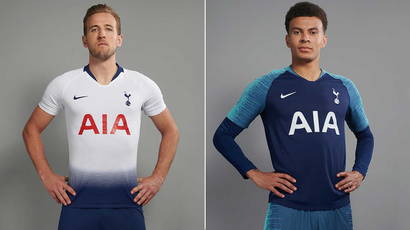
Home kit (left), and the away kit (right)

Image from @ESPNFC on twitter
On their own they look like someone was walking through some indigo dye, when paired with the matching blue shorts they look like you like a really high waisted short. Which is… well, fine I guess if that’s what you’re into.
The less said about the away kits the better, they are basically just Barcelona’s training kits with a different badge on them. It’s truly insulting.
The third jerseys I actually kind of do like, they feature a satellite view of North London on the top half. There was seemingly more thought put into this shirt than the other two combined.
Credit where it’s due, Nike has put some thought into the third jerseys for a number of their big clubs. I’ve already mentioned Man City’s third shirts.
Nike has also done similar work for other big European teams including Barcelona, Atletico Madrid, Roma, a highly hyped PSG/Jordan collab and my personal favourite from the bunch, Galatasaray. Many of these shirts are seemingly inspired by geography featuring aerial maps and the like.
If only that much thought and care went into the home and away jerseys.
Somehow Man Utd ended up with basically the same shirts as Spurs, only in red. Are Adidas and Nike just employing the same designer?
This promotional image makes it a little tough to see, but the bottom features a gradual blackening. It’s… not good, but slightly less embarrassing than Tottenham’s look. The giant Chevy logo on the front has never been a particularly attractive feature since they got the sponsorship, it’s always too big, even when it’s not.

The away kits are a very soft pink, apparently inspired by the evening editions of the saturday Manchester Evening News. I dunno, sure. I can’t say that isn’t true, I don’t live in Manchester. They look OK.
Chelsea is a team I can’t ever really say anything nice about.

These are either really boring or maybe my mind is just living in the past and can’t grasp their genius.
At least it’s a slight departure from the solid blue that they have been wearing pretty much as long as I can remember. There is nothing exciting or especially unique about these. They might as well be the random generic jersey Konami uses because they didn’t get the Premier League licence for Pro Evo.
Their away kits are yellow. Like, really yellow.
I hate them so much.
Standouts from the rest of the league
Everton’s away shirts are good. Shame they have a big dumb Angry Birds logo on the sleeve, otherwise they are very strong, a rare thing for me to say about Umbro. I don’t think I’ve complimented them since the last century. The home kits are boring and the thirds are a disaster, but at least they have these dope away shirts.

Wolverhampton has shockingly good kits this year. Clean understated design in both the home and aways. No gimmicks, no weird gradients, no magic eye inspired designs that have a hidden spaceship in them. You could almost accuse them of being boring if they weren’t so yellow— I mean gold. Were these an afterthought for Adidas? Maybe, probably. But they work really well.

Like Nike with their very lucrative, very expensive NFL deal, these companies have too much money tied in to really innovate or go outside the lines with their designs.
They are scared of taking missteps, and drawing the ire of thousands of old men who value “tradition” more than just about anything. It is a fear that is slightly less visible with smaller brands like Under Armor and Warrior (RIP) that are relative newcomers to football.
Chelsea, and Man City will more or less put out the same shirt year after year. Man Utd will occasionally get a little buckwild, but they are a brand that at this point, like Barcelona and Real Madrid, are just too big to fail and they will sell enough shirts worldwide for it to not really matter one way or another.
Joe Menjivar is the Sports and Style editor for OMID, he loves Tottenham but hates what they’re wearing this year. Follow him on Twitter
Disagree? We got a comments section.