
OMID NHL Preview Part 4 - Atlantic Division
I think I'm the only one here who likes sports, or at least the only one that likes watching professional sports. Oh, you don't watch hockey you say? You want to get into it this year, I hear? Well use this kinda useful mostly useless guide to deciding what team you should follow, primarily based on how much we like what they're wearing.
Each NHL team is graded by our panel of sports experts, Joe Menjivar, Lucas Roberts, and Adam Kostiuk. I can't say for sure, but at least one of us has watched a full hockey game in the past 12 months. Teams are to be judged on the following criteria: logo design, team colours, uniform design, and mascot/intangibles if they don't currently have a mascot. We've also included a handy section where we'll put a short blurb about who each teams best player is. There are no points for being a good player.
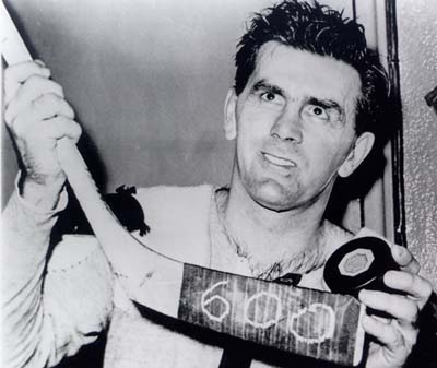
Boston
Best Player 10/10
Jack Donaghy
Logo: 5/10
Bruins! Big b, simple, Like the B sun, Like a stained glass window, in the shrine to hockey. All and all it’s simple but not Iconic. It’s a B with a circle around it. Take a risk, make a weird elephant holding a ball.
Colours 9/10 (on Bees) 2/10 (on humans)
Now I’m gunna let you finish but Bees wore it better… That didn’t work. They look like Bees and if they don’t have a Bee mascot then they’re trying to ignore the fact that they already look like bees or wasps. It’s not an awful colour combo, but it’s really hard for me to disassociate it with bees.

Uniforms 7/10
They look good, they look like Bees, they have big Bs on their chests so they basically are Bs. I really hope they have a Bee as a mascot. They are so far into this that if they don’t lean into it they are going to drown in it.
Mascot 2/10
It’s a bear… I mean I guess they eat honey? I’m not happy with it but I can see the logic. Big old bear is more intimidating than a bug. Meh..
Overall: 26/40
Buffalo Sabres

Best player
I dunno, probably Rick Jeanneret. They, don’t have much in the way of great players these days. Tyler Ennis is pretty ok, I guess, Matt Moulson will get you 30 goals. They have Jack Eichel coming in to look forward to, he’s projected to be a franchise player, but that is all theoretical. He could be a mega stud in a few years, he might even be ready on opening day.
Logo 4/10
A slightly updated version of their original logo. It features a charging buffalo above two crossed sabres. You don’t think that’s a little on the nose? Too cute by half.
Colours 5/10
Blue, yellow, white and a dash of silver. It’s a nice blue, works great with their yellow, but it has nothing to do with buffalo’s or sabres really. They’ve incorporated silver into their third jerseys and it’s a disaster.
Uniform 6/10
I really like the blue they’ve selected, and I’m a sucker for the player number on the front. Where it begins to fall apart for me is the third jersey. Its a mostly yellow monstrosity with some silver added to the sleeves that makes this looks more like it should be a Predators practice shirt. I like the treatment of the text and numbers on the back though. It’s a more rounded and modern typeface which I would like to see transition onto the main jersey.
Macot/Intangibles 3/10

Sabretooth sucks. They would have been better off with a talking sword, or like a buffalo, I dunno.
Overall 18/40
Detroit Red Wings
Best player

Ummmmm, I dunno, the reanimated corpse of Henrik Zetterberg? Dude is like a hundred years old. Good player though.
Logo 4/10
It’s ok. What does it even mean though? What is a red wing? They’ve been using the same logo since 1932. I guess at this point you might as well keep it. It’s fine, I’m not really offended by it, it seems like it would be a good logo to draw on your notebook if you’re in seventh grade. Whatever that means.
Colours 3/10
Red and white. Kinda dull.
Uniform 5/10
Like their logo, this uniform has remained more or less unchanged since the 1930’s. I guess its strength is in it’s simplicity. It’s not offensive, but I feel like they need to push the design. There is no third jersey, which, whatever. It’s fine, they’re fine, we’re all going to be fine.
Mascot/Intangibles 1/10

Al the Octopus. Seriously? No, eff that.
Overall: 13/40
Florida
DISQUALIFIED.
Reason:
It’s a crime against nature that a hockey team should even think it can exist in Florida.
Also I couldn’t think of anything relevant in hockey ever coming out of Florida, so I’m neglecting them on principal. If you really wanna know, the colours are like, a cross between the coyotes and the wild, and their logo is just literally a jumping panther that looks like it belongs on a cologne advertisement. Nothing special.
Montreal
Best Player 10/10
Rocket Richard, He’s the first hockey player I ever knew about. Even before old Wayne Gretzky. Plus I mean that’s one hell of a nick name. The best nickname I ever got was Spookus. It’s pretty cool but It’s only because I’m super scary Like a ghost, Not fast like a rocket!
Logo: 10/10
I feel like it would be unfair of me to shit on all the american teams for just using their letters as there logos and not mock this one. I do however know that they also have a little H in their logo as well. Not an M for montreal, or something basic like a hockey puck. Well the H is actually for hockey.. I thought it was for Habs but nope it’s Canadian hockey team translated.
“the classic 'C' and 'H' of the Montreal Canadiens was first used together in the 1917–18 season, when the club changed its name to "Club de hockey Canadien" from "Club athlétique Canadien",[37] before evolving to its current form in 1952–53. The "H" stands for "hockey", not "Habitants", a popular misconception.[38] According to NHL.com, the first man to refer to the team as "the Habs" was American Tex Rickard, owner of the Madison Square Garden, in 1924. Rickard apparently told a reporter that the "H" on the Canadiens' sweaters was for "Habitants".
This is just pulled from wikipedia but It’s still pretty neat if it is true. Regardless of how dumb the name is or how basic the logo is I love it (mostly because of that book my dad read me as a kid)
Colours 10/10
RED WHITE AND BLUE CANADA!!! Nothing gets more Canadian than this colours in this order. Take that America! Honestly though it’s clearly some insane level of bias but this works for me where the Rangers do not.

Uniforms 10/10
Brilliant, This is why the kid in that book wanted one so much. They look super cool.
MASCOT 100000010/10
Youppi is the coolest Mascot of all time. He started as the mascot for the Montreal Expos but when they sold the team he went over to the habs. He’s like a mutant orange thing I don’t even know but he’s the best thing in the world. I love youppi,
Overall: Fuck Youppi/40
Ottawa Senators

Best player
Erik Karlsson, he’s as reliable as a Volvo. Is that racist? Probably not, because he’s Swedish, you can’t be racist against Sweden, unless you’re like, Finnish or something.
Logo: 5/10
I personally like the original logo much better, which sounds kinda dumb coming from me because I keep talking about teams updating their looks. The logo isn’t even a senator, he’s like a Roman legionaire. This is ridiculous, but I guess they couldn’t have an old white guy in a bad fitting suit as a team mascot. Why even call yourself The Senators then? Why not the Centurions, or Legionnaires? Ugh, people are dumb sometimes. Whatever.
Colours: 7/10
Red, black, gold, and white, safe picks, they work. Ottawa is the capital, so I guess they couldnt exactly roll up in red, white, and blue. It’s fine.
Uniform 3/10
Another team with a played out look. These current threads have been their look since 2007, it’s time to move on. They have had the same third jesey since 2011, it’s an homage to the OG Ottawa Senators that existed like a hundred years ago and I can’t be bothered to care about. They’re not good, they’re pretty ugly.
Mascot/Intangibles 4/10

Spartacat is a lion, there’s not much else I can say about him. I guess he’s better than having a human mascot, those always look pretty weird. He’s pretty derpy looking though.
Overall 19/40
Tampa Bay

Best Player:
The referee.
THAT CUP BELONGED TO CALGARY AND YOU KNOW IT TAMPA.
2005 WAS OUR TIME.
Logo: 1/10
Probably one of the only teams in the league that has never had a good iteration of their logo. It has forever been a victim of ‘safe’ corporate design of its era, whether that was 2003 or 2009. You would think designers would be having a field day with a team like “lightning”, but if this is all they could come up with, well, it just proves there’s no imagination in Florida. Disney World doesn’t count, it’s a knockoff anyway.
Colours: 2/10
Boring blue and white. Sure.
Uniforms: 1/10
Being one of the only teams with a strict two-colour scheme, you would think they would take advantage of that and come up with some bold, striking way of representing themselves. Instead they look like the designer template for a jersey.
Mascots/Intangibles: 0/10
Thunderbug? Not even lightning bug? What the hell? Were you even trying? A BUG? Boo. Booooo.
Overall: 4/40
Toronto
Best Player

Based entirely on how much they look like a hockey player P. A. Parenteau is who I would consider to be the best player. He has Macgyver style hockey hair. That’s a bold statement in 2015, you’re basically telling the world you’re ok with having an almost mullet. As a hockey player I’ll take that as a admirable choice.
Logo (before looking it up)
I know this one because it’s in that book.. the one that I’m always talking about. With the kid who gets the wrong sweater from the Eatons. They made a beloved Canadian children's book about the Eatons screwing up! Maybe that’s why they closed down. The Eatons catalog was a Canadian staple though how else could you find stuff you never knew you always wanted before the internet. Regardless it was better than the Bay am I right? Or maybe not, I have no bone to pick with the Bay I just only know that I have to walk through it occasionally.
Logo (after looking up) 9/10
It’s simple, clean, and right to the point. Hasn’t been changed since the 70s. That’s amazing, I’m really happy they didn’t decide to slap an angry face, a hockey stick, or even a drop shadow on it in all that time. Good job
Colours: 8/10
Blue and white is not what I would have ever considered to be a Canadian colour combo but I’d say that pantone of blue with white is iconic enough in Canada, that it as recognizable as Tiffanys teal, no name yellow, and of course double double brown.
Uniforms: 9/10
I’m pretty into the simple jersey look, it always made it easier when asking someone else who’s who on the rink. “They’re the blue guys?” “yes.. “ replied my disappointed father.
Plus it’s pretty Iconic, knowing the vast amount about hockey that I clearly do, I can clearly describe maybe four jerseys, five if you include that of my “home team” but that’s due more to the proliferation of it in local, Tim hortons and strip clubs (places I frequent myself). I doubt I’m going to get kick back for liking this one.
Mascot/Intangibles: 10/10
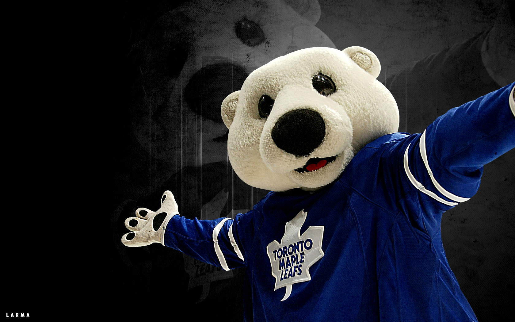
Holy Crap they have an adorable bear mascot! and his name is Carlton! Welp I think I’ve seen all I need to see. I’m officially pissed at the dumb french Canadian kid in the book who wanted moths to eat his Toronto Maple leafs sweater.

Total: 36/40
Lucas Roberts has a PhD (player haters degree)
Adam Kostiuk hates the player
Joe Menjivar hates the game