
OMID NHL Preview Part 3 - Metropolitan Division
Carolina
Best Player:

Harry Kane, he's one of our own.
They have a hurricane? Jesus, it’s probably that guy!
Logo: 3/10
It’s not bad, and I appreciate the lack of drop shadow, but all it amounts to is a furious ball of nothing around what looks like it could be some kids Beyblade. I guess it’s supposed to be a puck in a hurricane, but that’s only because I’m used to trying to guess what some shitty NHL jersey design is trying to communicate. It’s like its own kind of linguistics.
Colours: 5/10
Red, white, and black. Not an uncommon colour palette but Carolina puts a lot more emphasis on the red it seems, which is kind of neat.
Uniforms: 6/10
In all honesty it’d be a pretty striking jersey if not for the logo. The overwhelming red, the simple striping. There’s even an unconventional choice to vary the striping between the home and away jerseys. Not sure why, but maybe variety is the spice of life or something.
Mascots/Intangibles: 2/10

I think he's a pig?
Stormy the…. What? What the hell even is this thing? A bat? A chipmunk? Fuck it, it’s cute I guess. Two points.
Overall: 16/40
Colombus
Best Player:

I don’t know fuck all about Colombus and I don’t think you do either, so don’t judge.
(Editors note: I happen to know all about the Blue Jackets. I even dated a girl from Columbus, but that's a story for another time.)
Logo: AMERICA/10
Ahhhh, the good old blue jackets logo. Nothing makes me feel more like I just walked into the Mall of America/every other non-franchise theme park in America/design hell than the Blue Jackets logo. It looks like Uncle Sam ate freedom and shit the stars and stripes while watching hockey. I guess the flag is supposed to resemble a C, and it’s actually kind of pleasing to the eye… if you can actually recognize it. Also, look! It’s our old friend the beveled star from Dallas! Man, he sure gets around in this league.
Colours: 2/10
Red, White, and darker Blue, because the Capitals, New York, and five other teams did it first, and none of that mattered apparently.
Uniforms: 4/10
I can respect the unique striping and decision to leave the bottom of the jersey vacant, and if the colour scheme was better, this would actually be a relatively iconic Jersey. Unfortunately, its dedication to the Red, White, and Blue is weighing it down and holding it back.Wow. What a striking metaphor.
Mascots/Intangibles: 2/10
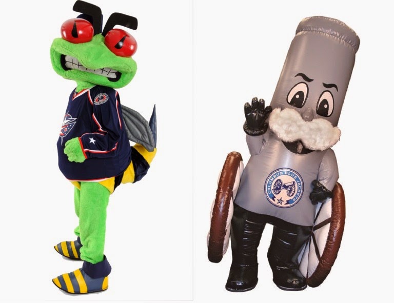
It’s supposed to be a hornet but it just looks like someone pepper sprayed Kermit and stuck him in a bee costume.
Big shout to their secondary mascot, which is the love child of Colonel Sanders and a cannon.
Overall: 8/40
New Jersey

Best Player:
Kevin Smith. Someone relevant has to have worn a Devils jersey at some point, right? Eh… I guess Brodeur. Whatever, I like Clerks 2 more so I’m giving it to Smith.
Logo: 7/10
Although the designer got a little overzealous with combining allll the elements into one contiguous shape….. they did an alright job, actually. I can see an N, a J, and some devil-esque features, all centered pleasingly on a perfectly bold circle. Very respectable, and impressively managed, much unlike the city of New Jersey.
Colours: 6/10
Red, white, and black, yet somehow noticeably different than the palette of the Blackhawks. It’s amazing what a little change in shade can do to the red. It’s maybe not the most striking palette ever, but it’s functional, and unique, so a success overall, much unlike the city of New Jersey.
Uniforms: 7/10
Straightforward and consistent striping on the jersey and the shorts. Classic, timeless, and proud, even. Much unlike the city of New Jersey.
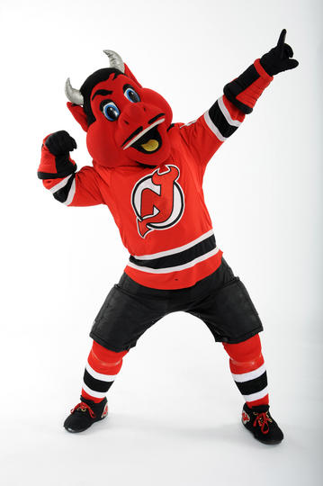
Mascots/Intangibles: 10/10
Woah-HO! This guy wants to PARTY! Just look at him! He looks like he knows how to throw the hell down, and who doesn’t wanna party with the devil every now and again? SA-WEET. Hey Lucifer, let’s go to the nosebleeds and see if we can piss off the organist!
Overall: 30/40
New York Islanders
Best Player
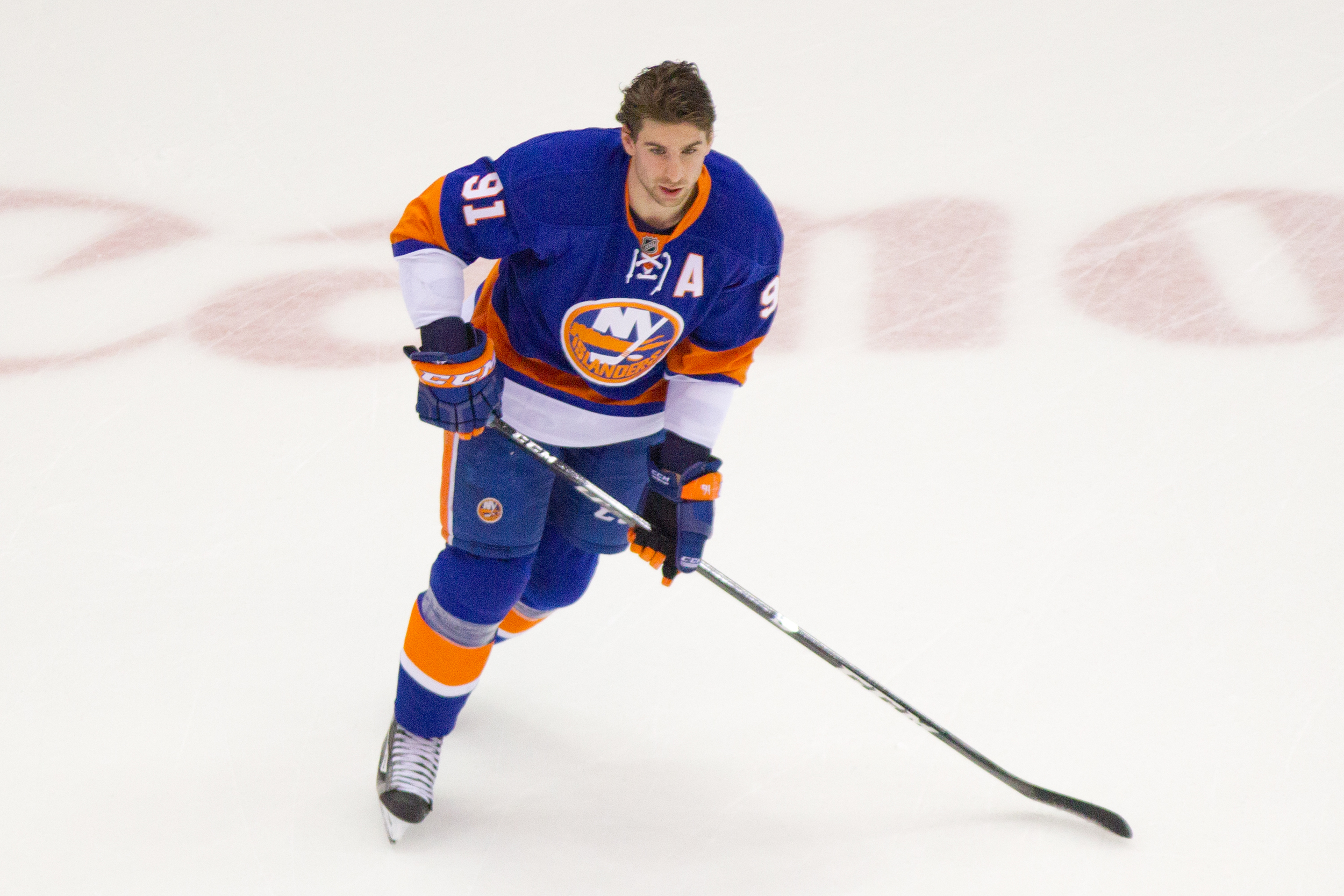
Former 1st overall pick in the 2009 NHL entry draft, and number one in my heart. Ok, not really, but strangely I have one of those McFarlane toys figues of him, it’s sitting on my dresser right now. I got it like 3 years ago for 2 dollars, my friend Ed cleaned up that day, he picked up basically a crate full of them for like 20 dollars, and now he has the most JaMarcus Russel figures of any man in the northern hemisphere (Hot tip: McFarlane toys has some Ricky Rubio figures on sale if you really want to disappoint someone this holiday season).
Logo: 3/10
It’s not really good. The ‘Y’ in the ‘NY’ turns into a hockey stick. Look, it’s a step up from the Gorton’s fisherman that they used to rock. Islanders games always made me hungry for fish sticks. Just playing, I’m always hungry for fish sticks.
Colours: 4/10
They’re basically working with an Oilers ass colour scheme here. I guess the blue is a little richer, or maybe my eyes are all messed up, I dunno. Maybe they had the colors first. That orange is a little too orange though. New black 3rd jerseys this year though, they’re… real boring, kinda like the Brooklyn Nets uniforms in the NBA.
Uniform 4/10

Speaking of boring uniforms, sorry Islanders fans, yours are real stinkers. They look like Oilers misprints that Charles Wang picked up on sale. Makes me miss the weirdo teal and orange numbers they had when I was growing up, at least they weren’t this boring. The new 3rd jerseys aren’t offensive, they’re just uninspired. What more can you say? Maybe they’ll look good on the players, and in motion, but in stills, they look real boring. Kudos for going black though, not enough teams are willing to go there, and it can be pretty potent.
Mascot/Intangibles 9/10
I dunno what it is, but I really like Sparky the Dragon. He’s pretty goofy looking, but all mascots are. I guess I just like dragons, and I like that Lucas hates dragons, so I’m giving them a lot of points here. Shout out to sparky, this dragon works 2 jobs, also mascotting for the New York Dragons of the Arena Football League, where he actually makes more sense.
Overall 20/40
New York Rangers

Best Player
ummm HUNK Alert! Henrik Lundqvist. This guy is a goaltender but not only looks like he hasn’t been taking punks and sticks to the face his whole career, he looks gorgeous. Like if David beckham and this guy where in the same room, there would be a lot of handsome in that room! More model than man, looks better in suits than some Jersey.
Logo before looking it up
I know this one as well because I feel like some sitcom has a character that’s pretty into them. Friends? Are the rangers better than the kings? There's probably some element I’m missing there.
Logo after looking it up: 6/10
Umm actually not the one I was thinking of, was definitely thinking of the islanders. All the same though it has the some of the same appeal to me as the LA kings logo. Simple, less like a logo and more like a crest. Nothing special though, could have tried a little harder than just putting your name in a box.
Colours: 7/10
AMERICA RED WHITE AND BLUE, This is surely america's team,
Uniforms 2/10
I mean, they really didn’t want to think too far out of the box for this one did they. Just a name on a Jersey. I like simple but I apour lazy, I’m leaning towards lazy with this one. Simple is the Nordiques, Lazy is the rangers.
Mascot -1000000000/10

Fuck Youppi.
So it appears they do not have a Mascot, So Now I’m convinced they are not investing any money into design. (unless they are spending it all on suits for Henrik, In that case go for it) But I did find a picture of Youppi the best mascot of all time wearing a Rangers Jersey. Upon further research he’s wearing it due to losing a bet with Jimmy Fallon… Youppi is a national treasure. HOW DARE THEY MAKE HIM UNCOMFORTABLE. Both the rangers and Fallon are dead to me forever. Like to see you lip sync battle your way out of this one! (monster)
Overall: -9999983/10
Philadelphia
Best Player

Wayne Simmonds, Shout out for being the only black Player that I’ve seen so far on this tour of the NHL. Also a Canadian boy as well, From Sccccarrrrrborough Toronto. I mean on first glance, nothing special about the rest of them of the roster. Bunch of toothless white dudes on various points of the bro spectrum.
Logo before looking it up
Cheese steaks, fresh prince?
Logo after looking it up 9/10
Alright, I can get behind this. flyers with a flying P thing. I’m impressed. It looks more like a curling logo, but the problem with that is that no one would see it. The more I look at it the more I like it. Top Job.
Colours 8/10
It’s not a popular colour choice, orange is is like reds degenerate cousin. More into the punk scene, not hanging out with the cool brands. I’m going to hand it to the Flyers though, I think them and Home depot have this colour on lock.
Uniforms 2/10
Not good, orange does not pair well with this much pasty white flesh. Someone get these guys a tan, They look like cheetos on skates
Mascot 0/10

Another team without a Mascot? That’s half the fun of going to see hockey as a kid. Top ideas for potential Mascots: The Fresh Prince, A Cheese Steak, Probably a bird, or the weird fat orange man they had as a mascot for one season Slapshot. Muppet style is for sure the way to go. BRING HIM BACK!
Overall: 10/40
Pittsburgh
Best Player:
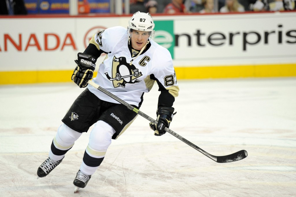
I hear that new Crosby kid is supposed to be pretty good? Lol I watched hockey in 2010
Logo: 3/10
Looks like someone shoved a stick up a dead penguin’s ass, made it a puppet and gave it a hockey stick. Then they threw a triangle behind it because hey, geometry was in at the time.
The saddest part about the whole thing was that, for a brief period of time, they actually got AHEAD of the game in the logo department.

Like… even by today’s standards, that looks modern. Not only does it respect the heritage of the original dorito shaped background, it fluidly incorporates a sleek, respectable looking penguin into the mix. It’s scalable too, looking good at patch and center jersey size. How they ever managed to make a flightless bird look elegant is beyond me, but they did, and for some reason abandoned it along the way to return to the seemingly giant meth-addicted terror penguin skating across a gold dorito with a hockey stick, coming right off the jersey and into your nightmares.
Come to think of it, maybe that was the point. Terror tactics.
Colours: 3/10
Gold, black, and white. Well, if you can call that gold. It’s more like a really sad brass colour, like that tuba you bought in your midlife crisis and never truly learned how to play. Why the team would ever abandon the winning, iconic combination of yellow, black, and white is beyond me. It mostly works for the Bruins and in the right layout could work for Pittsburgh too.
Uniforms: 2/10
Just completely uninspiring. It’s been said before in these reviews that some NHL teams took a DeLorean back to 2005 to hire some designers and it’s especially true in the case of the penguins. I guess the curvature of the patches on the sleeves is supposed to help the players resemble penguins, so I guessed someone missed the memo that you’re not actually supposed to try and look like your namesake, you’re supposed to play hockey.
Mascots/Intangibles: 5/10
A penguin? Predictable, but alright. Points deducted for the name “Iceburgh” though. Points thrown back in for having an oversized face with cross eyes, that’s just a winning formula.
Overall: 13/40

Editorial Intervention:
The current Penguins logo is tight as hell, and the colours are wonderful.
I can't let this stand, Penguins are being bumped up to 43/40, in part because that saucy penguin is adorable, but mainly out of spite. No way are we letting Chicago be the highest ranked team.
Washington Capitals
Best player

Alexander Ovechkin, this guy looks like a caveman and he scores. He’s probably scoring right now somewhere. He’s like 6’3” and 240 lbs of Russian beef, beef that is real good at putting the puck in the net. But look at him, you wouldn't want him dating your daughter.
Logo 7/10
It’s pretty OK. An update of the original logo The Capitals used for like their first 20 years. Even though it’s been in use since 2007 it doesn’t seem super dated to me. Sure if they wanted to update it, I wouldn’t be mad, but there are plenty of other teams that need a refresh a lot sooner (looking at you Vancouver.)
Colours 7/10
Classic American red, white, and a really nice shade of blue. Can’t go wrong with that if you’re the Capitals. It looks pretty american which is tougher than you might think, just look at the Blue Jackets, their jerseys make me think more of Paris St Germain than they do of America. The Capitals only look slightly less American than the Canadiens
Uniforms 6/10
I like them enough, but after 8 years it’s time to move on. What is with the NHL’s resistance to change? It seems like everyone just forgot that they’re allowed to change anything. It would be nice to see some more experimentation, aside from the third jerseys, which don’t always change that frequently. Speaking of third jerseys, the Capitals are just using throwbacks, which is boring. They aren’t different enough from the regular shirts, and where they are different is in how dated they are.

420 Blaze it.
Mascot/Intangibles 6/10
Slapshot the eagle has been the Capitals’ mascot since 1995. He’s a bald eagle, which is pretty American. I don’t like that he’s named Slapshot though, that has nothing to do with eagles, its just a word that’s used in hockey. It’s stupid. He looks pretty baked. Eagles are cool.
Overall 26/40
Adam Kostiuk doesn't know jack about penguins
Lucas Roberts can hold his breath for 69 seconds
Joe Menjivar tries real hard